
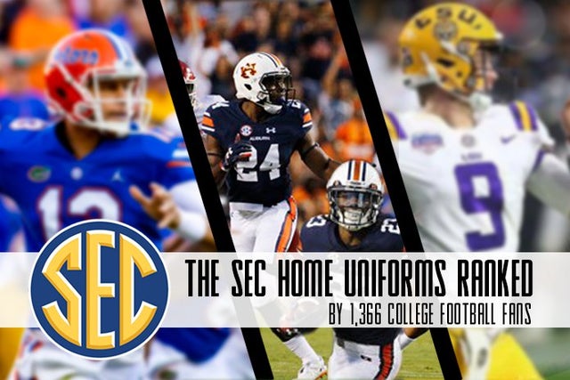
Since I began doing MaxDiff polls during the 2017 College Football season, I’ve received more requests to do uniform rankings than any other topic. Because we have until late August to wait for next season to kick off, let’s take a look at who fans think have the best home uniforms in the SEC, the league whose fans arguably pride themselves most on football tradition and on-the-field superiority.
In this research, each respondent evaluated 21 pairs of SEC home uniforms worn in the 2018-2019 season. In each pair, they chose the uniform they felt was the more appealing one. I then used fancy math (Hierarchical Bayes) to estimate the rankings for each respondent. This is a technique that is used extensively in corporate market research, and I’ve written ad nauseam in the past about how this method is better than traditional ranking systems because most people aren’t able to rank a list of more than five or six items. This system – called MaxDiff – breaks the ranking task down into discrete, manageable sets, which makes the ranking task easy and fun for respondents to give you their opinions. When survey respondents are engaged and having fun, they tend to give responses that more accurately reflect how they really feel.
The most difficult part of this research was choosing each team’s particular uniform kit to include in the exercise. I wanted to choose the kit each team most typically wears, but that’s a difficult task when some college football teams don’t wear the same kit twice at home in one season. Part of the reason why I chose the SEC for this exercise is because many teams in that conference tend to have relatively consistent, traditional uniforms that have remained unchanged for many years in order to stay true to the league’s culture. However, it was still difficult to decide the best kit to use for some of the teams that switch up their kits (i.e. Vanderbilt, Mizzou, and South Carolina). As a rule, I decided to use the kit each team wore the most times at home last season per the awesome spreadsheet put together on Redddit/CFB that detailed every uniform combination worn by each team in every game.
The Sample
I was fortunate enough to receive participation from 1,366 fans nationwide across the college football landscape. Unsurprisingly, there were more SEC fans than usual (because who is most likely to participate in a poll about the SEC?). However, I weighted the data so that the results reflect 50% participation from SEC fans, and 50% participation from Non SEC college football fans. In addition, I also applied weights so that each individual SEC fanbase is represented equally in the results.
All of this is to say that these results are not impacted by one particular team having a ton of fans participating in this research. If you personally disagree with the results below, that’s okay. The participants in this research didn’t all have the same opinions about each uniform, so I don’t expect everyone reading this article to either. Just don’t make the mistake of thinking these results are biased because a ton of your rival team’s fans were pushing the results against your team. That’s simply not the case.
Now Let’s Get to the Results

Interpreting the Scores: The MaxDiff scores for each team are indexed so that the average is 100. For example, Florida’s MaxDiff score of 135 means that team was ranked 35% higher than the average team in this exercise. It is important to note that these scores should not be interpreted as “votes.” See our explanation of MaxDiff if you would like more information.
Research Participants Give Their Opinions in Their Own Words
Displayed below some of the images used to conduct this research with commentary from fans who chose to give their opinions on a randomly selected team’s uniform. They were asked to give their own opinion on their assigned uniform and to speculate where other fans would rank it. The opinions below are not my own, and I don’t necessarily agree or disagree with any of them. I simply chose the quotes from research participants that captured the the most common sentiments voiced for each team’s uniform.
#14 Arkansas
Image Credit: Wesley Hitt/Getty Images
- “This particular Arkansas uniform probably won’t rank very high. It’s clean, but nothing really sets it apart from the Alabamas and Oklahomas of the world. However, the uniform they wear to play Texas A&M that is based off the Dallas Cowboys uniform is an awesome look.”
- “I would say bottom half. It’s a weird combination of simple, classic colors with modern font and numbers. I don’t think the two mix. It doesn’t do either a classic uniform or a modern uniform well.”
#13 Mississippi State
Image Credit: Keith Warren/Clarion Ledger
- “Bottom half. Love the block “M” on the helmet and the simple stripes on the jersey and pants, but the word mark on the front looks out of place. A simple “MSU” or something similar would’ve looked better in my opinion.”
- “The colors and logos are both drab and boring. It’s a clean, classic uniform design, but it’s dragged down by mediocre colors and logos.”
- “It has traditional elements, but nothing really stands out as either great or terrible.”
#12 South Carolina
Image Credit: Artie Walker Jr./Aiken Standard
- “Very clean and modern design, and the script Carolina on the helmet was a good move. Overall the uniform is visually appealing without being too busy or bland.”
- “I like their shade of red and the subtle use of black as a team color, this isn’t necessarily my favorite helmet of theirs, but it’s overall a good looking uniform.”
- “Bottom half. Just the dull color which is also very common in SEC. Nothing pops out or jumps at the screen. It would be better if it had some contrast with a unique helmet color but nothing about the SC uniform is visually stimulating.”
#11 Tennessee
Image Credit: Caitie McMekin/News Sentinel
- “It’s a classic look but my god that orange has to bring it down in the rankings.”
- “There is not enough contrast between the uniform so the Orange almost soaks up the white numbers/patches. Perhaps some dedicated stripes on the pants and a border in the numbers would assist with adding more depth.”
- “I think Tennessee should be in the top half because it’s classic, simple, clean, and the orange stands out. I actually really like the shade of orange, but I have a feeling a lot of people will knock them for it. Would have been better if they could have incorporated their classic checkered pattern while keeping the clean feel.”
- “Classic. Simple. Historic. Any time a uniform can be seen and instantly everyone in the country knows who it is, that’s a good uniform.”
#10 Mizzou
Image Credit: L.G. Patterson/AP Photo
- “The all black looks is definitely my favorite combination for Missouri. However, the SEC is particularly strong in overall uniform aesthetic. I’m a little biased towards traditional looks, so I’d guess Mizzou lands somewhere between 6-10.”
- “A little below the middle of the pack. in a conference with many classic designs, Mizzou mixes it up a little too much for my taste. I love the throwbacks they wear, but their standard uniform feels a bit too 2000s and not very classic.”
- “Mizzou has a good combo of clean and simple with a hint of flair. The fang like stripes down the leg and the all black look are awesome and there isn’t much else on the uniform to distract you.”
#9 Vanderbilt
Image Credit: Joe Howell
- “This is probably a mid tier uniform because it’s pretty bland. Black and gold is a great color scheme, and an anchor is always a cool logo to add, but i feel like they didn’t use the gold enough to accent the black.”
- “The solid black look isn’t my favorite, but the chain and anchor stripe on the helmets is a really, really cool element.”
#8 Texas A&M
Image Credit: Laura McKenzie/The Eagle
- “Around the middle. Classic color combo with contrast. The Texas patch is classic.”
- “The matte helmets make this a nice look. The jerseys and helmets match nicely, which is a rarely seen feature in CFB, as often teams will employ shiny or off color helmets paired with a jersey of a close but not exact color. While this is a more plain look, it’s still very clean. I think other fans will rank this uniform highly because of the simple but not boring look.”
#7 Kentucky
Image Credit: Mark Zerof/USA TODAY Sports
- “Top half. Blue is less common in the SEC (red/maroon are very common). The uniform is fairly simple, which is usually popular, and the checkerboard shoulders add some flair.”
- “Kentucky’s uniform is both simple in color and design, but has a distinct style matching their program. The sleeves are a nice touch without being overly flashy. They should be top half for sure.”
#6 Ole Miss
Image Credit: Vasha Hunt/USA TODAY Sports
- “Top half. I love the classic look and the vertical stripes.”
- “Ole Miss would definitely rank in the top half the of the SEC. This uniform is a classic look that contrasts the bright red with the dark navy very well. The classic shoulder stripe gives it a bit of character without doing too much.”
- “Red/shades of red are a bit overdone in the SEC, but the addition of navy (and sometimes powder blue) along with the classic shoulder stripes makes Ole Miss’ unis a winning combination.”
- “Top half. The red and blue is a classic combo, and the gray pants offset the bright red nicely. Their powder blue helmets are better, though.”
NOTE FROM FANJUICER: A PREFERENCE FOR OLE MISS’ POWDER BLUE HELMETS WAS COMMON.
#5 Alabama
Image Credit: Mickey Welsh/Montgomery Advertiser
- “The overall concept is simple and clean. The double stripes down the pant leg balances really well with the single stripe over the helmet. The crimson being the same shade throughout the uniform is a big plus. The number font is traditional and appealing.”
- “I think that ‘Bama will rank in the top 3 or 4 uniforms in the SEC. The “blue blood” simplicity of it is visually appealing and they’re one of the few schools that still do the old school numbers on the helmet.”
#4 Georgia
Image Credit: Curtis Compton/Atlanta Journal-Constitution via AP
- “Top 5 most likely. The uniform looks fantastic all around with a solid, dominant red at the forefront and a font that pops.”
- “Top half. Colors go well together, strong shade of red. Red and black is a classic, but mean color combination.”
- “Georgia should be in the top tier. I personally have them as the best overall uniform in the SEC. The color combo is great with the red popping against the gray, black, and white.”
#3 Florida
Image Credit: Lauren Bacho/Gatorsports.com
- “Iconic logo/script and unconventional color scheme help them stand out. The switch to Jordan brand uniforms might be polarizing for cfb fans though since it’s traditionally a basketball brand.”
- “Top half. Florida takes full advantage of their unique color contrast. A base coat of blue with some slight orange highlights around the numbers and in the stripes looks great. Throw in the all orange helmet (with blue highlights) and this uniform really pops. It’s a busy uniform, but it works. To minimize the uniform to a single color would make it either a boring blue or a bright orange eye sore.”
- “Top half. I like the striking colors and the color differentiation between helmet and jersey.”
#2 LSU
Image Credit: Ross D. Franklin/AP Photo
- “I’m a sucker for 3-color combos. Purple and gold go together really well, and LSU does a great job creating a uniform for it. I think this is a Top 3 uniform.”
- “This is probably a Top 5 uniform. It’s unique, in that LSU wears white at home. Featuring the purple and gold color scheme also happens to fit Louisiana perfectly. When you see this, you immediately know you’re watching LSU.”
- “Something about the mostly light color pallette, then the very dark contrast of the purple accents just looks perfect. The purple isn’t overwhelming, and this is such an underused color combination in sports.”
#1 Auburn
Image Credit: John Reed/USA TODAY Sports
- “Orange accents on a blue scheme are a good contrast and appealing pairing. Not too plain (it has stripes) but not too flashy or garish. The stripe styling keeps each element (helmet, shirt, pants) from not being a plain/boring solid color.”
- “I am morally obligated to say bottom half, because Auburn sucks (I’m an Alabama fan). However, I do love the blue interplay with the warmer orange. The stripes are thick enough to be a stand alone item in the uniform, and not some thin frill or a big fat blob of color.”
- “The classic pairing of dark blue with deep orange and white works well. Auburn has managed not to stray too far away from tradition while staying modern.”
- “Top half for sure. Navy and orange is never a bad color combo, and they do the simple jersey better than most. I also love the glossy look on the helmet stripe. The whole thing comes together quite well.”
- “There’s something here for those who like modern styles as well as those who like the classic look. I can’t explain it.”