
When it comes to the NFL, branding matters, and a team’s uniform is a big part of each team’s brand identity. To new viewers learning what your team is all about for the first time, your logo and uniform aesthetic are the first two branding elements most will use to judge what your brand means to them. That’s why these two elements are crucial to communicating your team’s brand identity to sports fans and the wider world. It isn’t surprising then that uniforms are often a topic of intense interest and discussion among sports fans. At the end of the day, uniform preferences and tastes are very subjective. There’s no objective way to say one uniform aesthetic is superior to another. However – fan perceptions matter. That’s why I was interested in how football fans around the world would rank the home uniforms of the NFL’s 32 franchises.
To accomplish this task, I recruited over 5,000 NFL fans from around the world (more information about the sample is provided below) to participate in a MaxDiff market research study. In this research, each respondent evaluated 33 pairs of NFL uniforms. In each pair, they chose the uniform they felt was the more appealing option. I then used fancy math (Aggregate Logit Analysis) to estimate the rankings.
This is a common research technique in corporate market research studies because a traditional ranking exercise in which each respondent views the full list and assigns a rank number to each item is too difficult and time consuming for most research participants. By contrast, MaxDiff breaks the ranking task down into discrete, manageable sets, which makes the ranking task easy and fun for respondents to give you their opinions. When survey respondents are engaged and having fun, they tend to give responses that more accurately reflect how they really feel. I’ve written ad nauseam in the past about how this method is better than traditional ranking systems because most people aren’t able to accurately rank a list of more than five or six items.
The Sample
This sample was recruited from a combination of FanJuicer’s online panel, Twitter, Facebook, and the awesome community at Reddit NFL, one of the largest, most engaged communities of NFL fans on the Internet. Fans from around the world participated, but most (unsurprisingly) were from the United States.
This sample was mostly composed of knowledgeable NFL fans. Slightly under 9 out of 10 (89%) indicated that they are close followers of the NFL (4-5 on a 5-point scale). In addition to self-reporting a high level of knowledge about the NFL, the respondents demonstrated their knowledge in the MaxDiff exercise by making logically consistent decisions reflective of well-defined opinions. I’m mentioning this because it’s important to keep in mind that most of the research participants had seen each uniform many times before participating in this study. As you’ll see, this has implications on the interpretation of the research results.
In the many sports fan research studies I’ve conducted in the past, the one variable that unsurprisingly tends to have the most impact on the results is team affiliation. That was the case in this research as well. To account for the fact that some fanbases were represented in greater numbers than others, I weighted the results so that each fanbase is accounted for equally. In other words, “homer bias” has been accounted for to some degree by weighting down the responses of the fanbases represented in large numbers (like the Patriots) and weighting up the responses of the fanbases represented in smaller numbers (like the Jaguars and Cardinals).
This is important because it means that the results displayed below are not impacted by one particular team having a ton of fans participating in this research. If you personally disagree with the results below, that’s okay. The participants in this research didn’t all agree, so I don’t expect everyone reading this article to either. Just don’t make the mistake of thinking these results are biased towards the teams with more fans participating in the study. That’s simply not the case here.
Now Let’s Get to the Results

Interpreting the Scores: The MaxDiff scores for each team are indexed so that the average is 100. For example, the Seahawks’ MaxDiff score of 115 means that team’s uniform was ranked 15% higher than the average uniform in this exercise. It is important to note that these scores should not be interpreted as “votes.” See my explanation of MaxDiff if you would like more information.
FanJuicer’s Take on the Results
I mentioned above that this sample is mostly composed of hardcore NFL fans because it is important to keep in mind when interpreting the results. Of the uniforms ranked in the top ten, nine of them are “classic” NFL uniform designs. This suggests a healthy respect for the heritage and traditions of NFL culture on the part of the research participants. The respondents’ open-ended assessments of the uniforms clearly demonstrate this (see below). Participants tended to describe the uniforms at the top as being “classic” and “clean.” By contrast, the word “modern” was more often than not used derisively to describe some of the uniforms that fell to the bottom of the rankings. I’m pointing this out because you should keep in mind that the research participants were taking into account the NFL’s unique culture and how each uniform’s aesthetics performed within that context. There is nothing wrong with that. I’ve found this to also be the case in my research studies ranking the NFL logos, NBA logos, and MLB logos. In short – sports fans don’t judge a team’s aesthetics purely in a vacuum – they judge them within the context of each sport’s unique culture and traditions, which they care about deeply.
Research Participants Give Their Opinions in Their Own Words
Displayed below are some of the images used to conduct this research with commentary from research participants who chose to give their opinions on a randomly selected team’s uniform. They were asked to give their own opinion on their assigned uniform and to speculate where other fans would rank it. The opinions below are not my own, and I don’t necessarily agree or disagree with any of them. I simply chose the quotes from research participants that captured the most common sentiments voiced for each team’s uniform.
I tried my best to select kits that were a good representation of what each team most frequently wears at home. This was difficult because a “home uniform” uniform is a fluid concept in the NFL. Many teams frequently switch up their kits and don’t have an official “home uniform.” While most teams typically wear their non-white, team color jerseys at home, some wear white and colored jerseys equally often (i.e. the Panthers). In those cases, I defaulted to a kit with a non-white jersey. The exception was the Cowboys who almost always wear their white jerseys at home, like the LSU Tigers.
#32 Tampa Bay Buccaneers
Image Credit: Kim Klement-USA TODAY Sports
- “Fans have hated this uniform since day one and I can definitely see why. First off, the gigantic logo on the helmet looks ridiculous. The jersey in general is a mess, but the alarm clock numbers are by far the worst part of the uniform.”
- “The number font is jarring, the orange clashes with the red, and I think it is fair to say that most fans strongly prefer the Buccs’ old creamsicle uniforms.”
- “The typeface used for the numbers and shoulders is just bad, there’s too many colors, and I’m not even going to mention the comically large helmet logo. It doesn’t help that the infamous creamsicle uniforms are much more memorable than this ensemble. I expect most of the higher ranked uniforms will have a more classic look.”
#31 New York Jets (new)
Image Credit: Julio Cortez / Associated Press
- “This is a bad redesign. It looks more like a college team uniform than a professional one. The shoulder stripe is a big downgrade. It takes all the character away from the Jets’ old unis and takes a big leap into blandness.”
- “Really nice color on the unis, but very boring. I do not dig the shoulder stripes.”
- “It looks like something a generic college team would wear. I really dislike how the jersey numbers are highlighted by a black outline and the ‘New York’ is not. I don’t know if I would put this last, but it’s close in my book.”
#30 Tennessee Titans
Image Credit: James Kenney / Associated Press
- “I like the dark blue with light blue accents, everything else I don’t like as much. This looks like an XFL uniform.”
- “The font used for the numbers is really bad, and the shoulder patches just look out of place. I think it would’ve been better to have solid color shoulders.”
- “The uniform is generally appealing. I don’t dislike the the modern aesthetic, but I think the typeface used for the numbers will take away from some of its appeal.”
#29 New England Patriots
Image Credit: Winslow Townson/AP Images for Panini
- “It’s clean, the lines look good and don’t go all over the place, but it’s a middle of the road uniform. There’s nothing there that makes me feel nostalgic, but it’s not particularly modern either. It’s just okay. Also, I don’t think people can be objective about how much they hate the Patriots.”
- “It’s not great, but not bad. The colors and design are both very generic. It doesn’t feel new or innovative, but I also don’t feel that this is a great classic looking uniform either. All in all, it looks like a uniform from a football video game that made up the teams because they couldn’t get licensing rights from the league.”
#28 Cleveland Browns
Image Credit: David Richard/AP Photo
- “Bottom half. The orange numbers and weird drop shadow definitely bring this uniform down a lot for me, especially when compared to the classic Browns uniforms. This is a good example of Nike trying to make a uniform more “modern” and only succeeding in making it worse. The other victims of this are the Buccaneers.”
- “The Cleveland Browns home uniform will likely be ranked near the bottom of the list. You have these big, cartoonish numbers, with a large ‘CLEVELAND’ on top of them plus the large, bright shoulder stripes on top of that. It is too cluttered with no sense of design harmony.”
- “Many people don’t like ‘CLEVELAND’ on the front, but I really like the classic football color scheme. The bands on the shoulders really define the jersey and the helmet is a classic.”
#27 Washington Redskins
Image Credit: AP Photo/Nick Wass
- “I find the team’s muted color palette to be really drab. Throw in those in-your-face yellow pants, and it doesn’t fix things.”
- “The colors and style are pure old school football and that resonates strongly with me. It will likely rank fairly low however, due to their logo.”
- “Hideous color combination that looks like it’s designed to clash and jar the senses. People might like this uniform for its “history,” but I disagree with that line of thinking.”
#26 Denver Broncos
Image Credit: Dustin Bradford/Getty Images
- “These would rank in the lower half for me. While the color scheme is fine and unique for the league, the ensemble itself is outdated and not well put together. Mixing a navy helmet with a bright orange jersey and white pants is not the most ideal way to mesh the brand’s colors together. The “swoop” stripe on the side of the jersey and pants feels like a visual relic from the 90’s or 2000’s.”
- “Fairly generic “modern” (aka mid 2000’s) style with the curved striping. I also don’t like the piping on the pant stripes. I think it would be cleaner with the solid stripe being consistent. I’m just not a fan of the curved striping overall.”
#25 Arizona Cardinals
Image Credit: Kelvin Kuo-USA TODAY Sports
- “I think this will be near the middle. The contrasting colors help, but a lack of uniqueness hurts it.”
- “Middle of the pack logo, pant striping, color scheme, numbers, and more. Looks just like a standard issue football outfit. I will admit they look amazing from far away, but up close there is nothing remarkable about these.”
#24 Los Angeles Rams
Image Credit: Matthew Emmons-USA TODAY Sports
- “I think this uniform will rank in the bottom half. While the gold and navy on its own is okay, the jersey clashes with the pants and helmet. The Rams bright blue and yellow uni is way better than this one.”
- “Bottom half. The uniform is very disjointed. The clashing of blue/white helmet and pants with the blue/gold jersey is very jarring. I understand this will be fixed next season with the new uniform roll out, but for now it’s pretty unappealing to the eye.”
Note from FanJuicer: I should have used the Rams’ bright blue and gold throwback uniforms in place of the above kit. Fans in this research frequently mentioned a strong preference for the bright blue and gold throwbacks. Although the above design is technically the “official” kit, the Rams are going to use the bright blue and gold throwbacks as much as they can until they are allowed to introduce a new design in 2020. I should have taken that into account. Sincere apologies, Rams’ fans.
#23 Dallas Cowboys
Image Credit: Ron Jenkins/Getty Images
- “They are historic, but have some hit and miss design elements. The negatives include having three different shades of blue throughout and having two different shades of silver for the helmet/pants. The positives include good looking block numbers, good looking shoulder/helmet/pant stripes, and a classically great logo. The helmet by itself is stunningly good, with a great logo and simple stripes.”
- “Dallas is an absolute timeless classic. It’s iconic in that they also often wear the white uniform at home and on the road. It gives it some major sticking power. While it’s a good uniform overall, I do have some quibbles with how Nike has made their once silver pants not exactly that color anymore. However, the big blue numbers, classic stripes, along with a prominent display of their top tier logo make it a good package.”
#22 Detroit Lions
Image Credit: Mike Mulholland-MLive.com
- “I’d guess that this will be ranked somewhere in the middle of the pack. A classic look with some modern elements that aren’t over the top like some of the newer uniforms like Tampa Bay. However, this uniform is outshined by the more classic uniforms like the Steelers, Saints, etc.”
- “The Honolulu blue just “pops.” The silver and blue is a great color combination, the typographic style of the numbers is just right. My only complaint would be the Lions wordmark on the shoulders. I think that should either be removed or replaced with the Lions’ logo.”
- “I think people prefer color schemes which are simple but still vivid. The Lions’ blue is immediately distinguishable from the other blue uniforms throughout the league. The contrast with the silver and white throughout the design is just enough to be eye-catching without being too extreme. I also like some of the details such as the stripes down the sides of the legs and the matching helmet and shoulder stripes.”
#21 Jacksonville Jaguars
Image Credit: Sam Greenwood/Getty Images
- “I like the black on black look but think they could have used more of the accentuating teal, maybe as a border around the numbers. Overall, I like it, but it feels like something is missing.”
- “I personally think this uniform is in the top half of the league. It is simple and clean with just the right amount of flair with the logo and teal stripes. I can see others ranking it low because they see it as boring.”
- “The Jags’ color palette is unique and I feel that some more color infused into the uniform similar to how it is around the collar would be good. The collar lines convey a sharpness and speed to them that fits the team image. A matte helmet might also improve this uniform.”
- “I believe this uniform will rank in the bottom half because it is a little boring. The Jags have great colors to work with and yet they came up with an incredibly plain design.”
#20 Atlanta Falcons
Image Credit: Scott Cunningham/Getty Images
- “I think fans will rank this towards the bottom, perhaps around number 20. It isn’t a very unique or striking uniform. Without the helmet, it could be hard to distinguish this uniform from the Cardinals’ uniform.”
- “I like the overall color profile, but the bright red shirt is distracting against white pants and a black helmet. It’s kind of like three different people selected the helmet, shirt and pants.”
- “I don’t like the white on the shoulders. They should go back to the black jerseys with red outline in the numbers.”
- “I love the red and black color scheme, but I’ve never liked when the helmet, jersey, and pants are all different colors. It’s too busy on the sleeves, and I think there’s too much white.”
- “I think that the white on the shoulders and black outline on the numbers make it seem halfway between a classic jersey and a modern one, and it ends up harming the look.”
#19 Baltimore Ravens
Image Credit: Patrick Smith/Getty Images
- “I think this will be top half. The purple, gold, and black work well together. The stripe on the pants is odd but not too distracting as it somewhat matches the jersey. The “B” logo on the pant stripe, however, seems unnecessary and out of place, as do the stripes on the helmet. The shadowed numbers look dated.”
- “I like the Ravens’ purple and the coat of arms on the shoulder. The simplicity is nice, but the thing that hurts it is the weird drop shadow on the numbers.”
- “Beautiful hue of purple, and I love the way the secondary logo pops on the shoulder patches.”
#18 Houston Texans
Image Credit: Bob Levey/Getty Images
- “The Houston Texans home uniforms easily belong in the top half, but definitely not the top tier. The navy and crimson color scheme is not particularly new or exciting, but it sure does look clean. There is a classic element in the red shoulder stripe and trim that compliments the blue so fittingly. It’s an attractive jersey with attractive colors.”
- “The blue and red have a great contrast where nothing gets lost but doesn’t cause annoyance. The stripes provide great accents but aren’t unnecessarily flashy. There’s plenty of blue and red teams in the league, but the Texans manage to stand out without being overly decorative.”
- “Houston’s jerseys have a good color combination that is safe. There’s nothing in your face about the uniform, but nothing too different about it either. The jerseys are hard to dislike, but they’re also unlikely to be your favorite.”
#17 Carolina Panthers
Image Credit: Jim Dedmon-USA TODAY Sports
- “I think Carolina’s uniform will rank highly because of the bold, yet tasteful color scheme. One of the best looking black jerseys in the league – solid mix of classic uniform elements with more modern stylings.”
- “The contrast with the bright blue and the black keeps it clean, and the blue border around the white helps it pop. Black jerseys seem to be pretty popular these days, and these do it right.”
#16 Cincinnati Bengals
Image Credit: David Kohl-USA TODAY Sports
- “I think this ranks in the top half because I love the way they incorporated Bengal stripes on to the helmet and throughout the uniform, which makes it unique.”
- “I think this one will be around the middle. I’m not particularly a fan of busy uniforms, but somehow there is something here that works.”
- “The tiger stripes are an iconic part of the uniform that sticks out more than any other team. I hate the Bengals, but if I lived in Cincinnati, I would always be reppin a jersey.”
- “I don’t like the uniform, but I imagine others will. It’s’ a bit too garish.”
#15 Miami Dolphins
Image Credit: Mark Brown/Getty Images
- “Personally, I think the Dolphins have a top 10, maybe top 5 uniform, but I’d expect they end up middle of the pack. It’s not exactly a classic look, but it works really well in my opinion – it’s rare you see a jersey with such a color palette without looking like a highlighter. The clean white helmet looks great.”
- “Top half. I think the use of the primary teal color works well with the white pants, while the secondary orange features provide a neat but not overwhelming contrast to the uniform as a whole.”
- “It jumps out. Everything on the Jersey is clear and easily read. The bright colors work well together in almost every environment.”
#14 Green Bay Packers
Image Credit: Kevin Jairaj-USA TODAY Sports
- “I think it’ll rank top half, because it’s simply a classic look. I like the combination of green and yellow with some small white accents, which makes a great look in my opinion. The yellow helmet is a good contrast to the green jersey.”
- “I believe the simplicity of the uniform, yet the complexity of the color scheme makes this a uniform that will be ranked in the top half. They have a simple, yet visually stimulating logo, and the green on yellow is visually pleasing. It’s not too complicated, but also not too boring.”
- “The Packers’ uniforms have got to be some of the ugliest in the league. The green jerseys are fine but those bright yellow pants are downright offensive. I don’t think there’s a color in existence that could possibly match with those things.”
- “I think this uniform will rank in the top half. It’s classic and screams old school football. There are a lot of classic elements reminiscent of the early days of the sport. I think many fans appreciate that.”
#13 Chicago Bears
Image Credit: Dennis Wierzbicki-USA TODAY Sports
- “The Chicago Bears uniform is in the traditional style, and it is paired with one of the most appealing color schemes in the league. In my opinion, their uniform should be in the top 10 of rankings.”
- “I think this uniform will rank in the top half. The dark blue and orange combination works very well in my opinion. I like how the numbers, shoulder stripes, and pant stripes all have a trim color to separate them from the main uniform.”
- “I think the Bears will be in the top half, but don’t think they’re at the very top. The dark blue/orange color combination always looks good, and the white pants are a nice clean contrast. A classic look that isn’t too busy. Putting the bear logo on the helmet instead of the ‘C’ would move them up in my opinion.”
- “It’s a uniform that stays true to the the core colors and uses them well. The numbers have an outline that is visually appealing and draws you in. The font is slim, good looking, and easy to read. It doesn’t try to get too cute.”
#12 Indianapolis Colts
Image Credit: Joe Robbins/Getty Images
- “Predicted rank: #14 The Colts’ home uniform is crisp and classic, featuring a strong ensemble of blue and white stripes across the helmet, shoulders, and pants to add variety without creating a busy look. The lack of an overly complex logo furthers the clean simplicity of the uniform. However, the classic look of the uniforms will only carry the Colts so far because there are other teams with a classic look superior to this one.”
- “The first word that comes to mind when looking at the Colts’ uniforms is “clean.” The double shoulder stripes are iconic, the number font is very befitting of such an historic team, and there’s no irrelevant clutter like wordmarks on the chest or accents to get in the way of things. To me, this uniform belongs in at least the top half of the league.”
- “I personally see the Colts as one of the cleanest and most classic designs in the NFL. Some may see the design as plain and antiquated, but I really like like the consistent striping and block numbers. The two-color look is also very clean. The helmet design blends well with both the home and away uniforms.”
- “A great base color and eye-catching vertical lines on the shoulders/helmet make this uniform stand out while not being crazy or outlandish.”
#11 Philadelphia Eagles
Image Credit: Al Tielemans via AP
- “Top half. The elements on the helmet are iconic and unique. The color contrasts works really well up close and from afar. One of my favorite overall NFL uniforms.”
- “I don’t like the blueish green main color, but the three colors coordinate well as a whole.”
- “Many fans still prefer the kelly green unis, but there is nothing wrong with these midnight greens. The helmet boosts this uniform by a lot, and without it, I think this uniform would be in the bottom half.”
#10 New York Giants
Image Credit: Sarah Stier/Getty Images
- “This will be in the top ten. The blue color scheme with white block numbers is synonymous with the Giants and it has the traditional football look with modern accents that overall create a nice combination.”
- “Simple yet effective. I really like the shade of blue, especially with the contrast it creates with the white numbers and pants. I love the shiny feel of the helmets.”
- “The color pallet is fantastic – it’s also a phenomenal shade of blue. The little hits of red really set it off without being overly rambunctious.”
- “The New York Football Giants should rank in the top half of NFL uniforms. Why? Because they keep it simple with a solid royal blue that is pleasing to the eye matched with clean white pants with accents down the outside of the leg. All together it’s a simple, clean look that I enjoy.”
- “Top half, possibly top ten; uniform is minimalistic with a clean contrast between the blocky, white numbers and dark blue jerseys. Glossy blue helmet with a clean, all white logo follows this same trend. Red, white and blue also go really well together. The numbers on the front and back of the helmets are a subjective taste, but I am one of those people that likes it. Overall, the simplicity and color scheme is what will make people like these jerseys.”
#9 Seattle Seahawks
Image Credit: Joe Nicholson-USA TODAY Sports
- “I think this is one of the best uniforms in the NFL. They are sleek with colors that pop without being too over-the-top.”
- “I would rank the Seahawks uniform in the top five. I really like the direction that Nike took their redesign. I enjoy the greater emphasis on the alternate color and like the imagery that the accents down the side of the pants and inside of the numbers evoke.”
- “The neon accent makes the jersey feel modern and fresh. The grey pattern on the numbers is visually appealing and gives it all very nice texture.”
- ” The navy blue and the bright green create a beautiful contrast, and the grey and white details give it a nice touch. Overall, it is really dynamic and pleasing to the eyes.”
#8 Kansas City Chiefs
Image Credit: Jay Biggerstaff-USA TODAY Sports
- “I feel pretty confident that this uniform will rank top 10. It features a vibrant red color that catches the eye without being too abrasive, and the gold border around the numbers work really well. I love the white face masks on the helmets too – I think the uniform has a great sense of cohesion overall. The only thing I don’t love are those white and gold stripes on the shoulder. I think they don’t really serve a purpose besides cluttering up the uniform.”
- “I love the classic uniforms that haven’t changed for decades. The chiefs uniform is simple and powerful. I think this comes in the top 8-12 range.”
- “I believe the Chiefs uniform will for sure fall in the top half of the uniforms. They have stuck with roughly the same iconic design for their whole franchise history, and that’s because it works. The uniforms look great – the red with the small yellow details around the numbers and stripes really helps those aspects pop. It’s a classic uniform that doesn’t need any updating or modification.”
#7 Los Angeles Chargers
Image Credit: AP Photo/Jae C. Hong
- “This uniform sadly lives in the shadow of the powder blue ones, but the contrast of the navy and gold held together with a powder blue outline is very appealing. The lightning logo is unique and tastefully incorporated.”
- “A modern update to a classic design. The addition of light blue to the lightning bolts adds a subtle pop.”
- “I rank this in the top 10. The lightning bolts on the pants and jerseys provide an unmatched aesthetic, but the baby blue contrasting the dark blue and yellow further illuminates the electricity.
- “LA Chargers may lack an LA fanbase, but they are one of the best looking uniforms in the league. The mix of blues surrounding the charged up lightning bolt makes it pop off of every player. This uniform is definitely top 10.”
#6 Oakland Raiders
Image Credit: Mark Brown/Getty Images
- “Classic football uniform. Basic, but stark contrasting colors. Traditional font for the numbers. Just feels like a uniform worn by a team with an old school culture and play style, which in my opinion is a positive.”
- “Top half easy, and for me it’s a top five home uniform kit. It’s simple, but my preferences scale that direction. The black and silver with block numbers is a winning look for me. In particular, I like the fact that they didn’t outline the numbers, as it makes for a really clean, minimalist look. I like that their logo is a spin on the NFL shield but Raider-ey, and it looks good on their helmet. As a Panthers fan, I’m envious of how good they make black and silver look.”
- “Top 5 most likely. I think it is so traditional and no-frills that many older NFL fans will prefer it. There’s very little to dislike. Black and silver are great colors. It also hasn’t changed in a very long time, adding to its reputation as a top tier uniform.”
- “The Raiders should be in the top 10, if not the top 5 NFL home uniforms. Besides the classic appeal, the cleanness of the black and silver really makes them stick out on the field. People who don’t watch football will recognize these uniforms.”
- “More than any other major sports league, the NFL’s fans eschew non-traditional color combinations and design themes. The Raiders’ uniforms will score major points for being both simplistic and fitting the ‘timeless’ mold.”
#5 Minnesota Vikings
Image Credit: Scott Takushi / Pioneer Press
- “I would say top 5, purple and yellow are hard colors to work with, yet somehow the Vikings have managed to make an elegant uniforms that is simple. Purple is also a hard color to keep consistent on different substrates (the fabric of the jersey vs the helmet). By going with the matte finish on the helmets, the purple stays pretty close to consistent while matching the simpleness of the rest of the uniform.”
- “The purple and gold is a classic combination. I also think the switch to matte helmets was a good choice.”
- “I personally think the helmets are one of if the best, if not the best designed in the NFL. I also like the consistency of the color scheme and the minimalist, clean design of the pants.”
#4 Buffalo Bills
Image Credit: Mark Konezny-USA TODAY Sports
- “If you’re going to do red, white, and blue, then this is how you do it. None of that soul-sucking navy or pretentious silver. These uniforms POP.”
- “I would rank the Bills’ uniforms top 10 in the league. I think that the bright blue and white go really well together. When you mix in the red accents in the number borders and shoulder stripes, it just makes the whole uniform pop.”
- “The Bills’ uni should be in the top 5. It does a great job of looking “clean” but not being boring. The bright blue contrasts excellently with the red trim, but is kept from being overbearing thanks to the white pants and helmet.”
- “The Bills uniform is definitely a good, classic uniform. The white helmet is visually appealing and the uniform elements – while simple – are bold and clear. Too many uniforms look like they’re trying too hard. That’s something the Bills avoid.”
#3 San Francisco 49ers
Image Credit: Sergio Estrada-USA TODAY Sports
- “I’m a big fan of the double stripe on the sleeve and three-tone pants with stripe. Helmet matching the pants as opposed to the jersey is also appealing. Simplicity of jersey and traditional lettering is nice.”
- “The 49ers’ unis do a great job by not doing too much. I appreciate the red and gold because it’s unmistakable who is wearing it.”
- “I think the 49ers will definitely be in the top half. The color combo of red and gold work perfectly together. The minimalist design also makes the uniform timeless.”
- “The 49ers’ uniform is going to rank in the top 5 because of its colors, which aren’t to dried out but also not obnoxiously bright, as well as how the gold represents the historical context behind the team name. This is a very well thought out uniform.”
- “Iconic design that only uses three colors. I like the sleeve stripes, and the uniform never feels “busy” or like they are trying to do too much.”
#2 Pittsburgh Steelers
Image Credit: Charles LeClaire-USA TODAY Sports
- “This uniform will end up in the top ten because of how unique and recognizable it is, as well as the fact that it is basic and has remained relatively unchanged for decades. The best ranking uniforms will be ones without piping or arbitrary lines going everywhere, while at the same time having recognizable features like the shoulder stripes. This uniform has a bold, but palatable color scheme. Pittsburgh’s uniform has most of what fans want, and none of the obvious faults of other teams. I would be shocked if this was not in the top 10.”
- “Hall of Fame level color combo, simple design, great classic look.”
- “The yellow and white really pop against the black jerseys and helmet, which is why I think this black jersey stands out versus other black jerseys.”
- “I think the Steelers have the one of the best uniforms in the league. They have a timeless design and a distinct color scheme consistent with the city of Pittsburgh.”
- “Black and yellow really compliment one another. The block number is also really simple, but appealing. The accents on the sleeves are are a unique detail without being too obnoxious.”
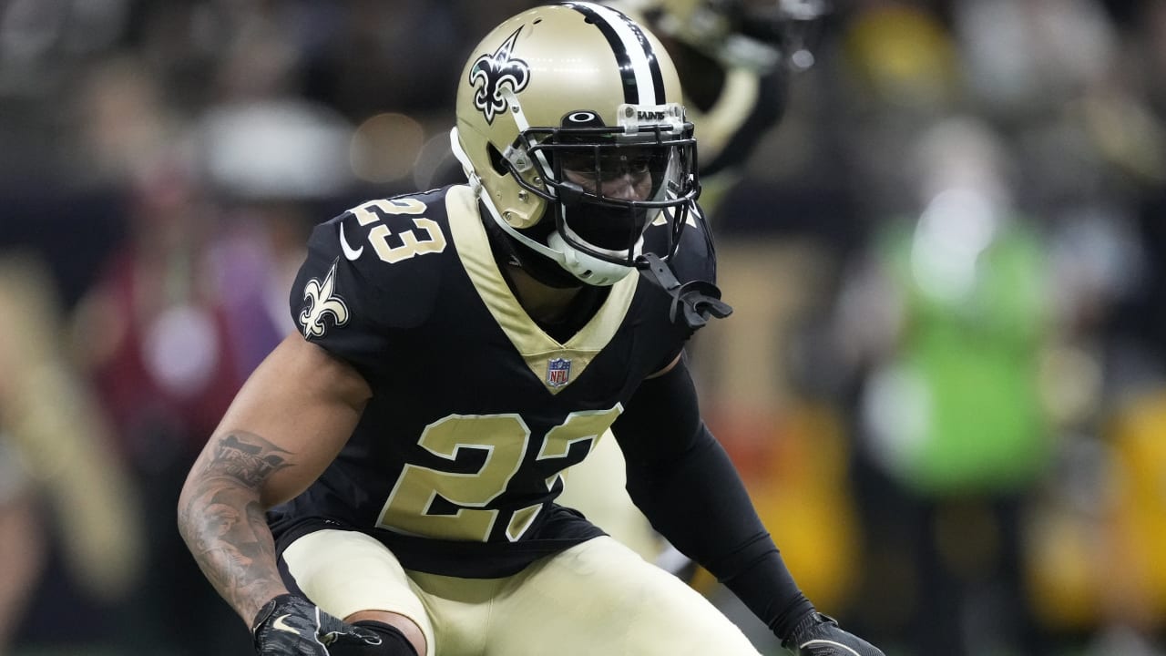
#1 New Orleans Saints
Image Credit: Chris Graythen/Getty Images
- “Black and Gold is sexy and easily recognizable, unlike the other all black jerseys in the league. Helmets haven’t changed to much in their history. This is very sleek and minimalist, which I think most NFL fans appreciate.”
- “I’d be surprised if this wasn’t in the top three – the mix of all black with gold is cool. It’s the type of thing even a non-football fan would wear because it’s fashionable.”
- “This uniform gets points for the black & gold, a classic combination that signifies style and royalty. The jerseys are clean and do not have too many stripes or bold colors.”
- “I think the Saints’ jerseys will def. rank in the top half. A lot of teams are doing the black jerseys these days, but the Saints do it right. Not too busy. Classic. Doesn’t remind me of arena football like the Panthers Jacksonville black uniforms.”
- “The all black look is sleek, allowing the gold to pop. They use the right amount of gold and don’t overdo things. Add that to the fact that they have one of the best logos in the league, and it’s an appealing look.
- “The Saints’ uniforms are clearly top half. They are clean, the black and gold compliment each other perfectly, and they aren’t full of busy unnecessary design elements. One of the rare occasions where a subtle outline around the numbers and logos is better than having none. These are iconic uniforms.”